4MC Partners Case Study.
Branding & Website Design
The Challenge.
4MC Partners is a boutique consultancy founded by a team of experienced professionals stepping out of large corporate environments to launch their own venture. With a sharp eye for quality and an instinctive sense of what doesn’t work, they needed a brand identity that reflected their clarity of thinking — and none of the corporate fluff.
As a newly formed business based in London (NW6 3BT), they needed:
A distinctive and professional brand identity
A clean, smart website to support early visibility and credibility
Consistent marketing assets (LinkedIn banners, pitch decks, templates) they could deploy immediately
The Approach.
We began with a brand discovery workshop, designed to unpack the team’s core values, audience focus, and tone of voice. This step proved invaluable — in the client’s own words:
“The brand discovery exercise was really helpful, as it forced us to put down on paper thoughts that we’ve either had in our heads or spoken about. Getting those concepts written down helps to focus the mind and make things more tangible.”
— Joel Obstfeld, Co-founder, 4MC Partners
The Creative Direction.
Tangrams as Metaphor
Among the logo concepts presented, the team chose the Tangram-based design — a visual system with deep philosophical relevance:
“The Tangram is not just a game; it’s a philosophy. Each shape represents the diverse expertise and perspectives our team brings. Together, they form a coherent whole — just like how we solve complex technological problems.”
We used the tangram metaphor to anchor the brand’s visual language:
Squares: Foundation & stability (their consulting expertise)
Triangles: Growth, innovation, and momentum
Parallelogram: Flexibility and adaptability — essential in today’s tech landscape
The tagline, “From Complexity to Clarity,” reinforced their unique positioning: simplifying the complex for clients.
The Outcome.
The result was a clean, confident brand presence that reflected the team’s tone perfectly:
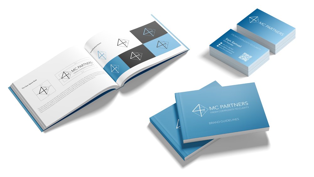
Smart, professional logo with layered meaning
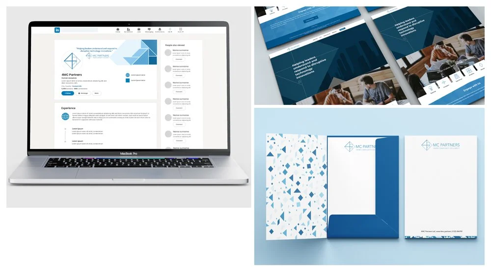
Fully responsive Squarespace website
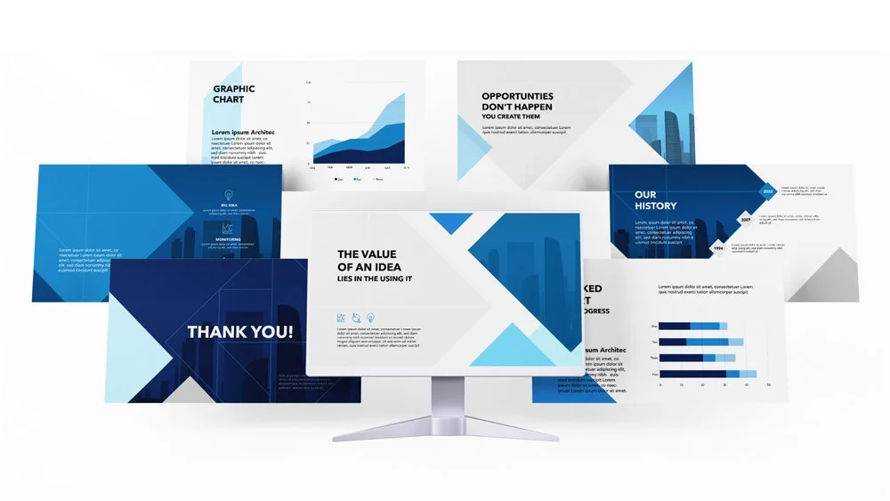
Custom LinkedIn banner, PowerPoint templates, and visual assets
Services Delivered.
Brand Strategy
Visual Identity Design
Logo System & Tagline
Website Design (Wordpress, Responsive)
Marketing Collateral (LinkedIn, PPT, Templates)
Live Site: www.4mc.partners
Book NOW to discuss your project with us!
“You and the team have given us a fantastic set of assets. The website has come together really well – smart, professional, nothing fussy – matches the team’s personality precisely. It’s a great foundation for us to build upon.”
Joel Obstfeld, Co-founder, 4MC Partners